 The hardest nut to crack in any type of analytics is getting our decision makers (bosses, leaders, marketers) to take action based on data.
The hard nut is not that we all are doing basic reporting about Visits and Bounces. Ok doing just that is lame. But still that's not all of it.
It might shock you that the hard nut is not even that we, the people who "play" with data, the Analysis Ninjas if you will, are not leveraging custom reports and advanced segmentation and activity alerts and all that cool stuff.
It is that no one wants to take action on our data. Ok not no one. But most of the time no one takes action based on our hard work.
Why?
To illustrate perhaps the most obvious, and yet hidden, problem I wanted to share with you a recent experience I had with data. It was not in the context of web analytics and yet I think it presents a solution to our problem.
On my (beloved) Nexus One android phone one of my absolute favorite applications isCardio Trainer. I just love it. The UI and the UX and how it is so darn easy to use (and much more well thought than competitors like My Tracks). You must get it.
I use it when I do any kind of exercise (or hike with the kids). You just open the app, say Start Workout, choose the type of work out (running, biking, elliptical, horseback riding, and 15 other choices) and you are up and running.
It starts tracking you (GPS and what not), pauses when you pause, and if you choose even talks to you (motivation!).
When the workout is done it gives you. . . . data!

Awesome right? What analyst / data person would not love this.
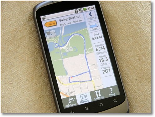
There is a sweet map (I can switch to the satellite view and see the buildings I went around!) and there is lots of data.
Time: 0:22:07 Distance: 6.74 kilometers Speed: 18.3 km/hr Calories: 207
It is a great dashboard.
For the first few times I used CardioTrainer I loved seeing the data (almost more than the fast bike ride). I would switch the map to the satellite view and drill down into the woods and the lake and the trees.
Of course I would look ay the data and maybe remember fragments.
Remind you of something?
Perhaps your web analytics dashboard. Or perhaps your "data summary report". Or, hopefully not, the data puke that goes to the entire management team.
Initially everyone's happy, nothing much happens, yet it feels good.
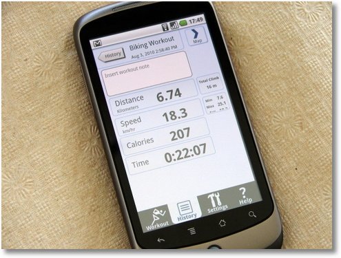
In my case pretty soon I switched to another view of the data, this one. . . .

Shorter summary. No gimmicks like the map. : ) A bit more data.
I can see Total Climb (elevation): 16 m. I can also see the min and max for Speed (max 25.1, min 7.5). Pretty good right?
This view felt better. It seemed like less data. Bit easier to remember the Calories.
I am embarrassed to admit that having two more speed numbers (min and max) made me forget the speed even faster, and that's a number I love to remember because I want to constantly beat it.
More data did not make life any more data driven.
Then the other day I noticed that CardioTrainer was auto-updated over the air (love this Android feature!).
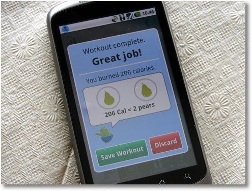
When I was done with the workout I was astounded to see this when I hit the End Workout button. . . .

All my beloved data was gone and it was replaced by this simple message:
2 Pears
OMG! Awesome!
Here is what was so cool (and not it was not just the Great Job! line):
1. All that data I had before had meant nothing. I remembered little. There was not much I changed or actioned based on it. Having data felt good. Did nothing. [Remind you of your Visits, Visitors, Page Views and Bounce Rate reports?]
With the new "dashboard" I realized I needed to ride more / harder instantly. Two pears was simply unacceptable!
[I am up to four pears, in just one week! ]
2. This one is key.
The CardioTrainer team took time to truly understand why I, and many others, workout and translated all that data into a clearly relatable and understandable "bottom-line outcome".
I exercise to stay fit (and not become overweight!). Calories and elevation and speed and distance are all great. But they are two steps removed from the outcome.
All those numbers don't matter. It is hard for the "HiPPO" (me!) to translate that data to understand what was the impact / outcome. Burning more calories seems obvious, but how much? And what did 206 calories mean?
Not any more. Now I can take those pears and tie them to how much I had consumed all day (vegan healthy food!), make a decision and take action.
I had all that data before, detailed data, and yet I hardly new what it meant. Now it was crystal clear: I had burned off an equivalent of 2 pears. I needed to change.
When you think of your day job as an Analyst. . . are you simply communicating data or do your reports have the equivalent of two pears?
For most of us the answer is no. No pears.
We love and provide data.
Not surprising that getting leaders to make decision is such a hard nut to crack right?

Here are two lessons I took away from this experience that are relevant to our efforts to create a data driven experience.
The "2 Pears" Web Analytics Action Driving Philosophy:
1. Simplify & focus.
Become a ruthless killing machine when it comes to metrics/data. Especially if the audience is our beloved HiPPO's or Sr. Management.
Our job is not to impress them with data or show them how clever we are with our segmentation strategy. Our job is to communicate, convince, drive action. CCDR. If you need a new acronym.
Ask yourself why every piece of data is on the report / dashboard / presentation. If it is not "instantly useful" kill it. And enjoy the kill.
Here's how: Kill Useless Web Metrics: Apply The "Three Layers Of So What" Test
2. Truly madly deeply understand the desired outcome.
The glorious thing was not just removing the data, it was the profound tie between the activity (exercise) and the outcome (more pears!).
In our case activity = website and outcomes = what?
That is the secret magical awesome question that needs answering.
It is not page views and bounce rates and time on site and browser versions. Surprisingly it is not even conversion rates or goals met. Very often all these metrics fall in activity.
What is the point of www.generalmills.com? Videos? Downloads? NO!
What is the point of www.lorealparisusa.com? Ecommerce? Surprisingly.. NO!
What is the point of www.nytimes.com? Page views? Not really.
What is the point of www.doctorswithoutborders.org? Current disasters listing? NO!
As an analyst for each site my job is to figure out what the "2 pears" are. I mean really figure it out. Not look for proxies. Pears! Talk to people, beg your management, be willing to go out on dates and take one for the team.
What is the one thing that matters the most, the reason why everything else happens, the singular reason all that data exists?
Then focus just on the pears on my Sr. Management reporting / presentations.
What was the change in "pears"? What we should do more? What should we do less?
End of the story.
Here's how: Win With Web Metrics: Ensure A Clear Line Of Sight To Net Income!
That's it.
Two simple lessons that if applied well will begin to move you towards communicating your brilliance the way it was meant to be communicated, and shift your organization to being more data driven.
Now every single time you look at your dashboard / performance summary / reports ask yourself this simple question:
Got Pears?
Ok it's your turn now.
Is the reporting you do crystal clear on the "pears"? If not why not? Have you seen other examples in the wild of insights presentation that have made you go "ah ha!!"? Care to share tips you have used to communicate effectively with your data audience? What is your company's secret to taking action based on data?
Please share your thoughts / critique / tips / screenshots / experience via comments.
 Oh and before I forget. . .
If you are on the Android platform go get CardioTrainer now!
Simply scan the QR code on the right with the Barcode Scanner app and before you say abracadabra you'll be on your way to happier data driven workouts!


